• Skip to primary navigation
  • Skip to main content
  • Home
  • About
  • Blog
  • Contact

Corner Mindscape

Tell your story on the web

You are here: Home / Blog

Supplementing ‘Serial’: Should a Podcast Be More Than Sound?

19th October 2016 by William Corner


Redefining Radio

The great thing about radio is that you can listen to it while doing something else – no need to remain stationary and fix your eyes on a glowing rectangle, or a paper one for that matter. With a podcast, essentially a downloadable or streamable radio show, you have the added benefit of listening whenever you want. I have spent countless hours listening to web design podcasts such as Shoptalk Show and Boag World while cleaning the bathroom or washing dishes. In a world where our attention is constantly divided and drained, I can still listen to two people talk for an hour or more every week, often on a very specific topic, because their disembodied voices are able to follow me around – or out of – the house. This is surely one of the main reasons why the grand-daddy of broadcast mediums has found a comfortable place in 21st century digital life.

The term ‘podcasting’ may well have been coined by Ben Hammersly in this Guardian article from 2004. 2004 was very much still the age of the iPod and although the iPod and iTunes have popular associations with the name and medium, podcasts are device-agnostic – most of them are simply mp3 audio files.

One of the key differences between a pure podcast and a radio show is the way in which the form and content of a podcast are shaped by the independent nature of its production. Podcasters embody the same frontier enthusiasm as bloggers, often independently producing shows focused on topics that would be too niche for mainstream airtime, circumventing the traditional gatekeepers of this airtime to occasionally reach global audiences. Despite this new freedom, I would argue it has taken podcasts backed by conventional broadcast media to push the idea of ‘listening to a podcast’ into the mainstream.

My first encounter with podcasting happened around 2006. I was living in Japan and would scrub my cubicle toilet while listening to BBC radio programmes such as Melvin Bragg’s ‘In Our Time’. These were broadcast radio shows streamed on-demand through BBC iPlayer. With the rise of on-demand media of all kinds, the boundaries between conventional radio and podcasting have become increasingly blurred. The BBC publishes its radio content as podcasts on iTunes as well as on BBC iPlayer. This 2016 article from The Guardian gives a list of selected podcasts, with a mix of mainstream broadcast and independent productions. Since 2006 I have produced a podcast series for English language teachers and the pilot episode for a fictional drama about English teachers in Japan – the former a company-sponsored show aimed at a very specific professional group, the latter a product of the DIY ethos.

Human Interest

Along with radio programmes on BBC iPlayer, the hybrid format of broadcast/podcast can be found in This American Life, an on-air Chicago Public Radio show and also one of the most popular podcasts in the world. The show is hosted by Ira Glass, a seasoned broadcaster with a knack for creating narrative tension through his natural, unforced delivery – a practised style which, by his own admission, took him many years to perfect. Each episode hangs a loose theme over various human interest stories, offering a mixture of surprise, humour and self-reflection, often with a socially conscious dimension to it. The reason why This American Life tops the charts is no-doubt a reflection of the type of general audience that listen to podcasts. Another similar hybrid radio show/podcast is Radiolab from New York Public Radio. Radiolab is more experimental in its use of soundscapes and audio effects. While the topics are broadly science-based, the show still focuses on storytelling through personal testimony and the lively banter of the hosts.

I have already written about how text can be transformed by web technologies. A simple example of how this relates to podcasting is the way in which This American Life publishes both a clean version of the show where strong language is bleeped out along with an uncensored version – something that would be impossible with conventional broadcasting. The show’s website also offers some basic additional material for those interested in creating their own podcast, featuring video clips of the makers, including Glass, talking about the practice of finding, researching and telling a good story.

What Happens Next?

In 2013, the producers of This American Life created the Serial podcast. Unlike its parent show, Serial was only available through the web, with iTunes being the most prominent distribution channel. The show has been marked out as the tipping-point for the podcast as a form of popular media, achieving the kind of public recognition (and, indeed conventional media coverage) reserved for films and TV shows. The obvious litmus test for Serial is whether or not you have heard of it. Serial has been featured everywhere from Buzzfeed to the Late Show with Stephen Colbert. By contrast, the interactive article ‘Snow Fall’ was mainly talked about by the web community. Even if you are interested in web storytelling, you are far less likely to have heard of it, than the Serial podcast.

When I first heard about Serial I mistook it for an elaborate work of online fiction. I also thought that it would involve a significant amount of extended multimedia content. I made these two assumptions based on the layout of the website which featured a map of a convenience store and a number of links inviting you to explore further evidence. I thought it was perhaps some whodunnit which would involve the listener/user working out clues. This wasn’t too far from what the show actually turned out to be.

The first series of Serial presented one true-life story concerning the brutal murder of a high school girl and the inconclusive case against her already convicted and imprisoned boyfriend. Although the event occurred back in 1999, the show’s producers had made contact with a campaigner who was trying to get the case reopened. Serial’s journalists carried out a live investigative report with new details emerging every week. The show’s popularity was down to this ‘real-time’ investigative journalism deploying the same polished storytelling techniques as This American Life. In particular, these techniques involve a kind of zooming out from and then into the different aspects of the story – standing back for a moment to explore the wider context or peering in to examine a particular moment in time.

The Reddit Transformation

While there was kind of virtuoso journalism being carried out by the show’s host and principle journalist, Sarah Koenig, the show also raised many questions about journalistic ethics. In particular, the popular discussion website Reddit became host to speculative threads on the series with amateur sleuths trying to find and post the addresses of the people involved in the case. One of the main characters under scrutiny went to online feature website The Intercept to tell his own side of the story. In a similar way to ‘Snow Fall’, we are on a perilous edge, creating compelling and innovative content out of real personal tragedy – in this case we also have an unwelcome dredging up of the past as people who had attempted to put the murder to the back of their minds were suddenly asked or felt compelled to answer questions over the phone or on their doorstep, even if this was done in the spirit of challenging a possible miscarriage of justice. True life stories – particularly tragic ones – are perhaps the most engaging but also the most delicate to handle. The unofficial digital transformations of Serial’s investigation via Reddit meant that this sensitivity was taken out of the hands of the producers and displaced into the rowdy, unaccountable and often anonymous milieu of the internet discussion forum. The prominence of Reddit discussion should be included as part of Serial’s impact and certainly went a large way to foregrounding the more controversial aspects of its presentation.

Dreaming of a Bigger Picture

With ‘Series 2’ there is more of an attempt to make the Serial website into a multimedia experience, now even closer to what I initially mistook Serial to be. Exhibiting a similar but less-experimental inter-connectivity to ‘Kafka’s Wound’, we have a ‘central text’ of audio episodes linked to supplementary content fragments. There are interactive maps similar to those seen in ‘Snow Fall’, infographics showing army uniforms, along with additional audio and video clips. The extra material adds further context to the episodes but comes across as peripheral. There is no tight integration between the listening experience and the browsing experience. I find that listening to a podcast episode and browsing the serial website are two distinct activities – the listener and user are split, so one does not displace your attention  to the other, whereas reading an interactive article like ‘Snow Fall’ is more integrated, but perhaps more in danger of displacing attention.

The supplementary material is perhaps necessary to an extent since the topic is way more ambitious and convoluted than Series 1. We move from a small-town murder that became a national news story because of the show to a national news story that taps into wider issues of American foreign policy and international affairs. Serial 2 takes up the case of Sgt Bow Bergdahl, an American soldier captured by the Taliban in Afghanistan and held in solitary confinement as a hostage for over five years before being released in a hostage trade deal, only then to be labelled as a deserter who had caused many problems over the years for the ground troops tasked with locating him.

Koenig does not interview Bergdahl directly but plays excerpts from his recorded phone conversations with filmmaker Mark Boal who interviewed him while gathering material for a screenplay. At one point Koenig interviews a key member of the Taliban who claimed to have captured and held Berghdahl in Afghanistan. Many of the later episodes ‘zoom out’ to wade through the mire of American politics and diplomacy. While series 2 has plenty of time to tell its story, including a two-part episode released in the same week, it struggles to keep the focus on the network of relationships and character portraits which I imagine appealed to many listeners of the first series. The show’s producers commissioned distinctive animated artwork from Carl Burton to create a sense of imaginary space for each episode – a visual cue for listening. These images have a dreamlike quality and for me recall the stylised Flash animation of the film Waltz with Bashir. The effect is radically different to reading about the events on a conventional news site. I think this was partly an attempt to evoke the digital impressionism of 3D video games – something to do with locating the podcast as part of a wider contemporary experience.

While Serial may have succeeded in raising the profile of the podcast as a form of mainstream media it does not transform the podcast into something radically different from a conventional radio show – and that might be a good thing considering the fragmentary experience of the supplementary material. Meanwhile, the independent podcasts with their quirky non-mainstream obsessions will continue to attract their niche audiences.

If you have not listened to Serial season’s 1 or 2 yet, I will leave you to do so without dissecting the final outcome. You can find more than enough dissection elsewhere on the web.

Key Links

  • This American Life website
  • Serial website
  • Serial Reddit discussion forum
  • Ira Glass writes about Radiolab
  • Radiolab website
  • Guardian article on podcasts
  • Hindenburg audio software aimed at radio and podcast production


Filed Under: Articles

Rocking ‘The Boat’: Websites and Interactive Graphic Novels

10th January 2016 by William Corner

Websites and Comics: Joining the Dots

Websites have more in common with comics than you might imagine:

  • both employ words and pictures in various strategic combinations within the confines of a (usually frame-based) layout,
  • both rely on the careful design of that layout to guide the eye from one element to the next,
  • and, controversially, both cater for shorter attention spans than commonly required for longform reading.

The relationship is close enough for comic theorist Scott McCloud’s book, ‘Understanding Comics’ (and also the sequel ‘Reinventing Comics’) to be held up by several web designers as providing greater insight into their field than many books on web design. While short comic strips such as those found on xkcd and The Oatmeal adapt themselves fairly well to the web, often presented exactly as they would be in print, attempts to transform the comic on the web have traced a faint line between enhanced experience and distracting gimmick.

McCloud, a widely-regarded authority on comics, wrote about this issue in a 2009 blog post where he drew attention to the self-referential experimentation of French comic artist Yves Bigerel, exploring how storytelling could be enhanced through a proper attention to the possibilities afforded by the web, particularly the ability to reveal elements and overlay frames in interesting and surprising ways. Bigerel’s DeviantArt showcase is illustrative of the playful, cheeky and subversive culture which has often surrounded the art form. The experiments were created using Adobe Flash, which, due to its proprietary nature and lack of mobile device support, has since been abandoned in favour of HTML5, CSS and JavaScript. McCloud does not agree with all of these ideas – his own key suggestion, touched on here in this TED talk, is to employ an ‘infinite canvas’ – expanding the flow of words and pictures in a way that is uninhibited by the conventions of the page or even the dimensions of the screen. A recent take on the infinite canvas can be found in Rachel Nabors’ proof-of-concept, ‘Alice in Videoland’. Nabors’ goal was to show that using the power of modern web browsers, McCloud’s ideas could now be implemented by people with a range of skill-sets without going too deep down the rabbit hole of one particular discipline.

Heightened Perceptions: Reality and Caricature

While I do not usually read episodic comics, I have read a number of so-called ‘graphic novels’, including From Hell, Persepolis, Maus, Palestine, Logicomix and, most recently, Alice in Sunderland. Most of these works are based on re-interpreting historical characters and events. The ‘graphic novel’ monicker has been applied to longform superhero or fantasy comics which aim at a more mature or sophisticated exploration of character and theme and there is some controversy over its use in marketing by publishers who may wish to disown the term, ‘comic’ altogether.

From reading my very particular selection of historical/biographical comics, here’s what I’ve come to believe: the freedom allowed in comic art to creatively reshape perception through graphic illustration, allows for a kind of heightened attention to how things are perceived in general. Since comics tend to visually re-shape the world more aggressively than photographs and live-action film, they function as a caricature of ‘realist’ perception (perhaps that is why they are sometimes seen as only appropriate for the untamed perceptions of children). This is why, for me, an animated film like Waltz with Bashir (which was made in part using Adobe Flash), can create a sense of ‘heightened perception’ – small details impact with an intensity that would be lost if they were presented in a more conventionally ‘realistic’ way (in the case of Waltz with Bashir this ‘heightened perception’ is thrown into relief with a sudden lurch into live-action documentary video). To look upon a particular railing or wine bottle, the dirt on a window or the crease of a brow, conveyed through the hand and eye of an artist, can provoke greater reflection on how we experience the world. This, of course, is no major news – it is readily applied to our reactions to impressionist or expressionist painting – in fact, any form of painting or visual art, but it is not always applied to storytelling through illustrations, which is why comics and animations have had a fight (in some countries, at least) to be recognised as ‘serious’ forms of art. Japan is, of course, often held up as a culture that embraces the impressionistic possibilities of graphic illustration in manga and anime, running the full gamut from science-fiction through pornography to romance and historical drama.

Creative Friction: Writing ‘The Boat’

And so we come to the ‘interactive graphic novel’, ‘The Boat’, commissioned by the Australian broadcaster SBS, and launched in Spring 2015. ‘The Boat’ was originally a short story written by prize-winning Australian author Nam Le and published back in 2008. It relates the journey of a Vietnamese girl as she is smuggled out of Vietnam and onto a refugee boat bound for Australia. The story is part of a collection, also called ‘The Boat’, a product of the creative friction of Le choosing to move against his instinctive rejection of writing ‘immigrant stories’ – a process which puts a meta-fictional spin on the ‘ethnic voice’ as being somehow inherently more authentic and therefore worthy of the attention of literary publishers. Is there any irony then, in the fact that a story embedded in a work of self-reflective post-colonial literature has ended up as a showcase for cutting-edge digital storytelling, commissioned by a national broadcaster? The project was commissioned for the 40th Anniversary of the fall of Saigon and was intended to give weight to the foundation narrative of the Vietnamese diaspora.

We should pause for a moment to consider why what might be considered more ‘worthy’ subject matter gets, quite rightly, green-lighted for web-based storytelling projects? Most likely it is because of the way that storytelling content presented on a website does not have the mass audience appeal of more ‘conventional’ digital media (videos, ebooks, mp3s) which people will pay to stream or download. Examples of web-based storytelling with high production values are often non-commercial projects funded by cultural institutions or straight-out advertising campaigns. An example of the former is The educational website for ‘Ice and Sky’, an expensively produced and freely available exercise in web-based storytelling, which explains the origins of climate change science (and which also happens to start with a boat at sea). In contrast, we have an advert for the Peugeot Hybrid 4 (a high-profile proof-of-concept advert showcased on many web design sites) and a Christmas campaign for Welsh public transport.

Motion Sickness: Animating Words and Pictures

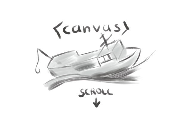
‘The Boat’ provokes a strong sense of internal space and perception of the external world. This ‘heightened perception’ very much fits the creative re-shaping I mentioned earlier and is embodied in the hand-painted sumi-e style artwork of Vietnamese-American artist Matt Huynh. Sumi-e is the Japanese black ink painting associated with zen circles, bamboo stalks and cherry trees – a style which along with ukiyo-e woodblock prints, influenced both European Impressionism and the Japanese manga style of comic art. This makes the whole experience feel more organic than is usually the case with digital comics. Strokes are broad and free, suggesting motion blur and the physical and psychological instability of the protagonists. In a similar way to Waltz with Bashir, ‘ The Boat’ places photos of a real refugee boat and Vietnamese refugees at the end of the story, juxtaposing these realist archival images with the impressionist/expressionist presentation which has come before. ‘The Boat’ makes use of the HTML5 canvas element, which provides a standardised way of manipulating complex visual layouts on a web page. This means we are moving towards websites which require recent hardware to render a smooth visual experience in a similar way to the ‘system requirements’ of video games and you may find things flow rather less well if you’re trying to view it on a 10-year-old laptop. However, the adherence to core web technologies should mean that the boat will be available to view for as long as SBS continue to host it – one of the key issues in web-based storytelling is the longevity of the technologies used.

An important enhancement of the work is the use of movement created by the parallax effect popularised in ‘Snow Fall’ and taken further here with true 3D elements (using a JavaScript library called three.js). A usability issue levelled against the parallax effect is that it causes motion sickness – the effect is disorienting, but with ‘The Boat’, I imagine that this is kind of the point. The intention of a piece of dramatic storytelling on the web may well be to move in the opposite direction from the research suggested by User Experience design in order to actively confuse and disorient the user/reader. In some sections, sentences lurch into view at unexpected angles or materialise from the background. I am reminded here of the novel, House of Leaves by Mark Z. Danielewski, where paragraphs and fragments of text are re-arranged on the page to create an unfolding and disorienting sense of space. Danielewski was working with the idea that the pages of a printed book could take on the visual fabric of film and with the ‘The Boat’ we glimpse the potential (and the problems) of animating words on the screen subjected to the motion they describe.

The use of reveals and ‘beats’, indicated by Bigrel’s earlier experiments, are deployed here, but occur when you scroll down the page rather than click, the images and words flowing into view. This downwards motion gives the strong impression that you are somehow ‘descending into’ the story, creating a new form of spatial and temporal relation to narrative. Moments of tension are created with the scrolling motion when, for example, a body is thrown overboard. Sound also plays a major role in the presentation – we read about what we hear and storms and songs fade in and out in synchronicity with the visuals. The title section states that ‘Headphones are recommended’, suggesting an introspective, solitary pursuit.

‘The Boat’ website is so fully immersed in audio-visual fluidity that it might just about escape the accusation of trying to digitally enhance any conventional reading experience. It could also qualify as embodying some of what Scott McCloud has meant by the idea of an ‘infinite canvas’. While this does not establish a new paradigm, it makes a provocative case not only for how a comic or graphic novel can be transformed by the digital medium but also for what can be done in the emerging sphere of interactive web-based literary production.

This article is part of a blog series about Storytelling and web design.

Key Links:

  • ‘The Boat’
  • Scott McCloud’s inventions (including the ‘infinite canvas’)
  • Rachel Nabors’ course on CSS Animation
  • Nabors’ post about how to create Alice in Videoland
  • The Peugeot Hybrid 4 advert
  • 3D JavaScript library (three.js) – includes ‘The Boat’ in its showcase
  • ‘The Sound and Vision of the Boat’
  • The Boat: About The Characters
  • Sydney Morning Herald article on ‘The Boat’
  • The Boat – Interactive Comic on Behance

Filed Under: Articles Tagged With: graphic novel, interactive, storytelling, web design

The ‘Snow Fall’ Effect: Parallax Storytelling on the Web

10th December 2015 by William Corner

In 2012, The New York Times published a web-based ‘feature article’ called ‘Snow Fall: The Avalanche at Tunnel Creek’. The story, written by John Branch, depicts the real-life tragedy of an avalanche encountered during the dangerous pursuit of back-country skiing. There are graphic descriptions of the aftermath; it is compelling reading. There is a strong sense of the ‘natural sublime’; the landscape is vast, awe-inspiring and capable of large-scale devastation. There is also an element of voyeurism related to the human tragedy that perhaps cannot be detached from the innovative visual presentation. ‘Snow Fall’ became famous for pioneering a high-production-value longform reading experience on the web, transformed by various multimedia elements and a technique known as parallax scrolling. The article led to a figurative avalanche of ‘art-directed’ longform multimedia features and a swirl of debate about their effectiveness.

The Parallax View: Multi-layered Storytelling

While parallax scrolling has its origins in the multiplane camera effects of animated films such as Disney’s Snow White and the Seven Dwarfs, parallax as a visual effect in computer graphics dates back to 80s video games (‘Moon Patrol’ is credited with being the first to employ it). I remember being ten years old and standing in a department store, staring wide-eyed at an Amiga 500 running ‘Shadow of the Beast’. The side-scrolling background was created from 12 ‘parallax’ layers, each layer scrolling slightly slower than the one above to create an uncanny illusion of depth through motion – in this case, a green field receding towards the mountains. The visual trick was a technical achievement for the time, summoning a landscape greater than the confines of the screen.

As video game hardware has become capable of producing true 3D environments, the 2D speed-based parallax effect has fallen out of favour. In recent years, parallax has been revived in web design, where it is used as a way of adding depth to (mostly) vertically scrolling websites. It has become a frequent design element in web-based storytelling, more often in journalistic features than works of fiction. In 2015 parallax has been around long enough to have peaked as a trend – major websites like Spotify, which previously employed parallax on their landing pages, have since redesigned them to be parallax-free. A University study showed mixed results about the effectiveness of parallax in User Experience (UX) design. However, User Experience (UX) or User Interface (UI) design trends are often concerned precisely with use – their utilitarian focus does not always reflect the new user/reader hybrid – are you browsing a hotel website or reading about an avalanche? While Parallax is only one of many techniques used in visual storytelling, it has perhaps been the most prominent and controversial. As we become more comfortable with web-based storytelling, we must ask if parallax adds anything to the longform reading experience and what might develop from its use.

Portrait and Landscape: The Importance of Frames

Unlike Kafka’s Wound (the focus of my previous post), ‘Snow Fall’ is a steadfastly linear read; parallax only works when the user/reader scrolls (most often from top to bottom) to further the progression of the story. ‘Snow Fall’ uses Chapters as clear starting points for the scroll, but once started, the reader encounters transitions rather than page turns; the parallax effect is employed at the top of the chapter and at various intervals where the page breaks away leaving the eye dangling over an animated mountain range. Perhaps ‘Snow Fall’ became an archetype precisely because the expansive visual experience reflected the subject matter. The point of using an effect such as parallax should be to exploit the relationship between form and content in a process of ‘framing’.

The parallax effect is just one aspect of this framing strategy in ‘Snow Fall’. As the page scrolls down, we encounter multimedia elements that fade into and out of the white background. The story is accompanied by a range of animated map data. We view the story from multiple angles or ‘frames of reference’; from the formal and scientific viewpoint of infographic data to the intimate personal viewpoint of photo galleries and testimonial video – often very emotionally charged in tone. ‘Snow Fall’ includes raw audio of a Mountain Rescue radio operator reporting the deaths of members of the group to friends and relatives back at the ski resort. The audio is embedded beside the writer’s description of the event – this is a still strange multimedia combination of prose writing trying to describe something that is also included ‘as it is’. This comparative space between the thing and its description now extends from the static relation of photographs and illustrations to temporal audio and video.

‘Snow Fall’ won a Pulitzer Prize and attracted much publicity in the online and offline print world, to the extent that ‘to snowfall’ became a niche verb-meme in the digital publishing industry and a ‘Snowfaller in chief’ was appointed at The New York Times. Praise and criticism is well documented in the web design blogosphere. Bobbie Johnson, writing on behalf of the well-known digital publishing platform, Medium, wrote an article called ‘Snowfallen’ in 2013 with the subhead reading ‘Just because you can, it doesn’t mean you should.’ Jonson was concerned that, in the wake of ‘Snow Fall’s impact, longform publishing platforms such as Medium would be expected to create more ‘innovative’ multimedia articles. We hear the familiar accusation of distracting presentation: “Can you even remember what happens in Snowfall? Do you remember who wrote it? What did the multimedia help you do?” These questions are best answered by reading ‘Snow Fall’ for yourself. Johnson goes on to point out the disconnect between form and content: “When you add multimedia elements, they have to work for the reader. They have to be in the service of the reading experience. They have to make the story better. Instead, they’re already starting to become the entire point of the experience.” The problem, as I see it, is that ‘Snow Fall’ fitted the ‘frame’ and that there is justified reservation about trying to fit other content into that same design.

Scroll to Continue…

Johnson provides a useful crowed-sourced google spreadsheet of articles similar to ‘Snow Fall’ which gives you an idea of how the technique has been used elsewhere (as well as some earlier attempts at multimedia storytelling). Notable examples are music website Pitchfork’s art-directed ‘cover stories’ on Bat for Lashes and Daft Punk, both of which incorporate animated photoshoot imagery into a multiplane magazine-style layout, and a subsequent NYT article called ‘Tomato Can Blues’, which combines parallax with graphic novel-style artwork to tell the true story of a cage fighter who faked his own death. In the case of the Pitchfork articles and ‘Tomato Can Blues’, the ‘framing’ is far more portrait than landscape. Interestingly, ‘Tomato Can Blues’ uses the multiplane layering of parallax to create a sense of claustrophobia instead of expanse.

An alternative example of web-based visual storytelling can be found in ‘Firestorm’, created by The Guardian (a rival to The New York Times for innovative web journalism). ‘Firestorm’ is the story surrounding the smartphone photos taken by a Tasmanian family stranded out on a jetty during a savage bushfire. Once again we are immersed in a sense of foreboding for most of the read, which leads to the depiction of a natural disaster; in the case of ‘Snow Fall’, the avalanche, in the case of ‘Firestorm’ the Bushfire. ‘Firestorm’ is more multimedia heavy than ‘Snow Fall’ using looping video backgrounds behind sparse text. Because of the constraints of video we are back in more familiar screen/frame territory here – a more claustrophobic experience. While Firestorm does not use the parallax effect to depict its landscape, it still uses the scroll to tell its story.

Given the range of web-based templates, libraries and services available now it is relatively easy to reproduce the basic framing devices of ‘Snow Fall’. The makers of a web design tool called Skroll Kit were apparently sued by The New York Times after they posted a YouTube video claiming that the layout could be replicated using their tool in about an hour. Skroll Kit has since been sold to Automattic, the commercial arm of WordPress, but there are numerous online solutions for building a multimedia story, such as Atavist, Shorthand, Racontr and the WordPress plugin, Aesop Story Engine.

The parallax effect is capable of creating an immersive visual experience given the right content, but it doesn’t add out-of-the-box enhancement to visual storytelling. More often than not, when used without consideration, parallax can disengage a sense of continuity between form and content. The stereotypical parallax site wants to suggest expanse – parallax website templates often use stock photos of mountain ranges to showcase their visual effects in a strange echo of ‘Shadow of the Beast’ on the Amiga 500. It is vital that these types of effect are used appropriately as ways to frame particular content. However, it is also possible for the content to reconfigure the frame in interesting and unusual ways.

Perhaps one of the most visually striking recent examples of Parallax in storytelling can be found in ‘The Boat’, a web-based animated graphic novel commissioned by Australian broadcasting company SBS and based on a short story by Nam Le. ‘The Boat’ uses parallax, animation, sound and scanned sumi-e artwork. Here parallax suggests both the expanse of the ocean and physical and psychological claustrophobia. I will be looking more closely at ‘The Boat’ in my next blog post.

This article is part of a blog series about Storytelling and web design.

Key Links

  • ‘Snow Fall: The Avalanche at Tunnel Creek’
  • ‘Snowfallen’ by Bobbie Johnson of Medium
  • Johnson’s crowdsourced Google spreadsheet:
  • A University study at Purdue University into the effectiveness of parallax in User Experience design
  • Excellent YouTube series by Dev Tips exploring more examples, plus a tutorial on how to make a parallax website

Filed Under: Articles Tagged With: Longform, parallax, snow fall, storytelling, web design

Inspecting ‘Kafka’s Wound’: Innovation and Interaction in the Web Essay

23rd September 2015 by William Corner

Reading on the web is associated with a decrease in attention span. As you read this, you are probably thinking about skipping a few paragraphs to see where things will lead. If you can get the gist of an idea by skimming and scanning, that’s maybe all you need. Why not just read the conclusion to swipe the key points and takeaways before attending to the numerous browser tabs or other devices dividing and competing for your attention? What do you gain from focusing entirely, and for a sustained period of time on one passage of text? What if that text also opens out into other content, demanding even more of your attention?

This poses a problem for any ‘long read’ on the web.

Reading is Already Interactive

The web is an interactive (or bi-directional) medium – but I would argue that reading itself is already interactive in a way that listening or watching is not, even if the interaction is between reader and text rather than between ‘writers’. While it takes attention and imaginative thinking to interpret sound and images, it takes the additional mental work (literacy) to understand a sentence and frame the resulting meanings and thoughts appropriately in the mind.

The front-end design of websites is moving away from skeuomorphic control panels to flat and fluid layouts with attractive typography, playing to the strengths of tablets and high-resolution displays. This has created an experience that feels more like a moving magazine. At the same time some earnest designers and developers have attempted to transplant longform writing to the web. Longform gives our attention spans a purifying ‘literate’ fitness regime to purge the sugary tweet, pin or listicle. It feels like a workout because reading and writing longform content is difficult and time-consuming compared to most other activities on the web. Websites such as Longreads curate this type of writing and blogging platforms such as Medium publish it.

Medium is a good example of the trend towards longer writing on the web, acknowledging its perceived effort – the site gives you an estimate of how long any given post will take to read. It seems to me, however, that Medium is mostly transplanting writing to the web, rather than transforming it. There is a good reason for this – transforming writing often leads to disorienting or distracting reading experiences. Let’s imagine the written text as the ‘main track’. The aim is then to create immersive experiences by adding other forms of interconnected media. In this situation, it is easy to end up not with immersive enhancement but with distracting asides which jolt us out of what was already an immersive experience with the ‘main track’.

Demanding Attention

The London Review of Books (LRB) is steadfastly committed to traditional long reads – the printed edition of this literary review presents four columns of densely-set type within which discursive essays explore subjects from contemporary Middle Eastern politics to the History of Science and the Philosophy of Mind. These are not the terse book reviews you may find in a Sunday broadsheet. The books under review are usually jumping-off points for the reviewer – an authority on the subject in their own right – to explore the subject within their own terms. Sometimes there are no books being reviewed at all. Here we are in ‘essay’ territory – the literary form pioneered by Montaigne and carried through to modern universities and the academic culture that surrounds them, but not much written or read outside of this sphere. LRB essays demand attention spans not associated with web-based reading, so in 2012 – perhaps as an act of provocation – the LRB commissioned a ‘digital essay’ which attempted both to transplant and transform writing on the web.

Attracting Distraction?

A web-based arts initiative called The Space, developed by the Arts Council and the BBC, collaborated with the author Will Self, Brunel University and the LRB to produce the digital essay, entitled ‘Kafka’s Wound: a digital literary essay by Will Self’. The main track of ‘Kafka’s Wound’ is a conventional essay by Self, exploring the various connotations of the wound of a terminally ill patient in Kafka’s short story, ‘A Country Doctor’ and the entire short story is accessible from one of the many hyperlinks offset in the margin. The essay is an exercise in associative thinking – the excavation of ideas and construction of new links between them. It is, on the surface at least, an exploration of the visceral immediacy of wounds – however the connotations suggest the opening up and absorption into a problematic and frightening space, involving virulent infection. Self writes more than once that he is guilty of absorption by associative thinking. There are clear connections here not only with the synthesizing preoccupations of an active imagination but also with the compulsive and ‘viral’ hyper-linking of the web.

A series of interconnected nodes, rather like a mind map, float and jostle for position above the text. The nodes are related to notes along the right margin. The node clusters have centralised colour-coded categories for content associated with the core text. The embedded content varies from an hour-long documentary about Will Self’s psychogeographical trip to Prague, to various artist’s responses to the themes of the essay. Are these responses and footnotes to the text of the essay, or part of the essay itself? The documentary is long enough to suggest that the essay could be a response to the film. In this space, the reader of a text necessarily becomes a user of a website – a reader/user hybrid.

In the same year a Pulizer-prize winning digital article called ‘Snow Fall’ appeared on the New York Times website and there was much noise about ‘production values’, throwing into question the likelihood of this type of article becoming the norm. I imagine the expense was not so much in the technology but in paying a team to create the interactive content. This suggests that the ‘opening out’ of content leads to a necessary call and response from and to different content creators. Even though there was a central author writing the ‘main track’ of text, both ‘Snow Fall’ and ‘Kafka’s Wound’ were produced by a team of collaborators. For ‘Kafka’s Wound’, much of the material was sourced from BBC archives or students at Brunel University.

The Long Web: Code and Convention

The designers of The Space used a customised version of WordPress to create the website. WordPress is a free open-source publishing platform, powering around 23 per cent of the web. The software has played a key role in making online publishing accessible by allowing anyone to install it and create a blog-based website in minutes. While ‘Kafka’s Wound’ is referred to as a ‘digital essay’ it was created using HTML, CSS and JavaScript , which have established themselves as the staple languages of the web. It is worth noting that anyone with the right know-how could recreate the form of this using free open-source technology, which – at least in ‘computer years’ – is likely to endure for some time. HTML may not be as proven as ink on paper but – as web developer Jeremy Keith argued in his talk, The Long Web – it might have the best chance of enduring over other digital formats.

These languages do not limit the format in a way which the printing press has limited the page – the use of native web technologies provide the layout with a more expansive feel, unencumbered by the confined frames of the previously dominant Flash-based ‘multimedia’ content or the earlier and even more confined CD-Rom. This is an important change from the idea of text embedded in a pre-defined screen-frame, to a formatted, styled document, which can open outwards on a potentially infinite ‘sheet’ or contract to arrange itself on whichever sized glowing rectangle you happen to view it on.

Necessary Experimentation

What is interesting about ‘Kafka’s Wound’ is the self-conscious experimentation. The whole project is, like Self, guilty of associative thinking – immersed in a frenzy of hyperlinks. These links both distract the reader and provide further insight. We are somewhere between the terms of post-modern decentralisation and disorientation and a more focused modernist experimentation with form.

Like many other ‘proof-of-concept’ projects on the web the digital essay aims to raise more questions than it answers. Relatively new industries such as e-Learning have been trying to establish paradigms and formalise the new medium, but the open-ended nature of what web technology can achieve means that that such attempts are prone to failure, both in terms of establishing themselves as paradigms and of delivering effective experiences to the user/reader. ‘Kafka’s Wound’, as an experiment, is able to flaunt disorientation in a way that a commercial project would not.

I am writing this in 2015 – ‘Kafka’s Wound’ came out in 2012 and not much has changed since then. I think this is because, while the web has some parallels with video gaming, the developments we are interested in here do not concern advancements in computer graphics hardware and augmented or virtual reality, but the slow development of a mature digital medium – giving a continuity and stability in the creation of form and content, a situation not quite the same as that indicated by retro post-modern ideas about ‘cyberspace’. While there is a common culture in the world of web (and computing in general) to see change as something rapid and often revolutionary, I think that we are in the early stages of figuring out how this more adaptable medium might lead to works of paradigmatic importance captured in novels and films (and also, arguably, video games). The technology itself need not be cutting-edge, but rather established to a point where what is done with it can lead to something comparative to paper-based literature – where a ‘website’ can have the same cultural impact as a novel.

This article is part of a blog series about Storytelling and web design.

Key Links

  • ‘Kafka’s Wound’
  • Jeremy Keith on the Long Web
  • Example of Javascript framework to create interconnected nodes
  • Brunel University research case study on ‘Kafka’s Wound’
  • Slideshare about the making of ‘Kafka’s Wound’

Filed Under: Articles Tagged With: Digital essay, Longform, Will Self

hello@cornermindscape.com

Copyright ©2019 · Corner Mindscape - All Rights Reserved