Websites and Comics: Joining the Dots
Websites have more in common with comics than you might imagine:
- both employ words and pictures in various strategic combinations within the confines of a (usually frame-based) layout,
- both rely on the careful design of that layout to guide the eye from one element to the next,
- and, controversially, both cater for shorter attention spans than commonly required for longform reading.
The relationship is close enough for comic theorist Scott McCloud’s book, ‘Understanding Comics’ (and also the sequel ‘Reinventing Comics’) to be held up by several web designers as providing greater insight into their field than many books on web design. While short comic strips such as those found on xkcd and The Oatmeal adapt themselves fairly well to the web, often presented exactly as they would be in print, attempts to transform the comic on the web have traced a faint line between enhanced experience and distracting gimmick.
McCloud, a widely-regarded authority on comics, wrote about this issue in a 2009 blog post where he drew attention to the self-referential experimentation of French comic artist Yves Bigerel, exploring how storytelling could be enhanced through a proper attention to the possibilities afforded by the web, particularly the ability to reveal elements and overlay frames in interesting and surprising ways. Bigerel’s DeviantArt showcase is illustrative of the playful, cheeky and subversive culture which has often surrounded the art form. The experiments were created using Adobe Flash, which, due to its proprietary nature and lack of mobile device support, has since been abandoned in favour of HTML5, CSS and JavaScript. McCloud does not agree with all of these ideas – his own key suggestion, touched on here in this TED talk, is to employ an ‘infinite canvas’ – expanding the flow of words and pictures in a way that is uninhibited by the conventions of the page or even the dimensions of the screen. A recent take on the infinite canvas can be found in Rachel Nabors’ proof-of-concept, ‘Alice in Videoland’. Nabors’ goal was to show that using the power of modern web browsers, McCloud’s ideas could now be implemented by people with a range of skill-sets without going too deep down the rabbit hole of one particular discipline.
Heightened Perceptions: Reality and Caricature
While I do not usually read episodic comics, I have read a number of so-called ‘graphic novels’, including From Hell, Persepolis, Maus, Palestine, Logicomix and, most recently, Alice in Sunderland. Most of these works are based on re-interpreting historical characters and events. The ‘graphic novel’ monicker has been applied to longform superhero or fantasy comics which aim at a more mature or sophisticated exploration of character and theme and there is some controversy over its use in marketing by publishers who may wish to disown the term, ‘comic’ altogether.
From reading my very particular selection of historical/biographical comics, here’s what I’ve come to believe: the freedom allowed in comic art to creatively reshape perception through graphic illustration, allows for a kind of heightened attention to how things are perceived in general. Since comics tend to visually re-shape the world more aggressively than photographs and live-action film, they function as a caricature of ‘realist’ perception (perhaps that is why they are sometimes seen as only appropriate for the untamed perceptions of children). This is why, for me, an animated film like Waltz with Bashir (which was made in part using Adobe Flash), can create a sense of ‘heightened perception’ – small details impact with an intensity that would be lost if they were presented in a more conventionally ‘realistic’ way (in the case of Waltz with Bashir this ‘heightened perception’ is thrown into relief with a sudden lurch into live-action documentary video). To look upon a particular railing or wine bottle, the dirt on a window or the crease of a brow, conveyed through the hand and eye of an artist, can provoke greater reflection on how we experience the world. This, of course, is no major news – it is readily applied to our reactions to impressionist or expressionist painting – in fact, any form of painting or visual art, but it is not always applied to storytelling through illustrations, which is why comics and animations have had a fight (in some countries, at least) to be recognised as ‘serious’ forms of art. Japan is, of course, often held up as a culture that embraces the impressionistic possibilities of graphic illustration in manga and anime, running the full gamut from science-fiction through pornography to romance and historical drama.
Creative Friction: Writing ‘The Boat’
And so we come to the ‘interactive graphic novel’, ‘The Boat’, commissioned by the Australian broadcaster SBS, and launched in Spring 2015. ‘The Boat’ was originally a short story written by prize-winning Australian author Nam Le and published back in 2008. It relates the journey of a Vietnamese girl as she is smuggled out of Vietnam and onto a refugee boat bound for Australia. The story is part of a collection, also called ‘The Boat’, a product of the creative friction of Le choosing to move against his instinctive rejection of writing ‘immigrant stories’ – a process which puts a meta-fictional spin on the ‘ethnic voice’ as being somehow inherently more authentic and therefore worthy of the attention of literary publishers. Is there any irony then, in the fact that a story embedded in a work of self-reflective post-colonial literature has ended up as a showcase for cutting-edge digital storytelling, commissioned by a national broadcaster? The project was commissioned for the 40th Anniversary of the fall of Saigon and was intended to give weight to the foundation narrative of the Vietnamese diaspora.
We should pause for a moment to consider why what might be considered more ‘worthy’ subject matter gets, quite rightly, green-lighted for web-based storytelling projects? Most likely it is because of the way that storytelling content presented on a website does not have the mass audience appeal of more ‘conventional’ digital media (videos, ebooks, mp3s) which people will pay to stream or download. Examples of web-based storytelling with high production values are often non-commercial projects funded by cultural institutions or straight-out advertising campaigns. An example of the former is The educational website for ‘Ice and Sky’, an expensively produced and freely available exercise in web-based storytelling, which explains the origins of climate change science (and which also happens to start with a boat at sea). In contrast, we have an advert for the Peugeot Hybrid 4 (a high-profile proof-of-concept advert showcased on many web design sites) and a Christmas campaign for Welsh public transport.
Motion Sickness: Animating Words and Pictures
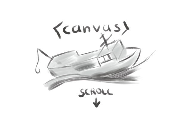
‘The Boat’ provokes a strong sense of internal space and perception of the external world. This ‘heightened perception’ very much fits the creative re-shaping I mentioned earlier and is embodied in the hand-painted sumi-e style artwork of Vietnamese-American artist Matt Huynh. Sumi-e is the Japanese black ink painting associated with zen circles, bamboo stalks and cherry trees – a style which along with ukiyo-e woodblock prints, influenced both European Impressionism and the Japanese manga style of comic art. This makes the whole experience feel more organic than is usually the case with digital comics. Strokes are broad and free, suggesting motion blur and the physical and psychological instability of the protagonists. In a similar way to Waltz with Bashir, ‘ The Boat’ places photos of a real refugee boat and Vietnamese refugees at the end of the story, juxtaposing these realist archival images with the impressionist/expressionist presentation which has come before. ‘The Boat’ makes use of the HTML5 canvas element, which provides a standardised way of manipulating complex visual layouts on a web page. This means we are moving towards websites which require recent hardware to render a smooth visual experience in a similar way to the ‘system requirements’ of video games and you may find things flow rather less well if you’re trying to view it on a 10-year-old laptop. However, the adherence to core web technologies should mean that the boat will be available to view for as long as SBS continue to host it – one of the key issues in web-based storytelling is the longevity of the technologies used.
An important enhancement of the work is the use of movement created by the parallax effect popularised in ‘Snow Fall’ and taken further here with true 3D elements (using a JavaScript library called three.js). A usability issue levelled against the parallax effect is that it causes motion sickness – the effect is disorienting, but with ‘The Boat’, I imagine that this is kind of the point. The intention of a piece of dramatic storytelling on the web may well be to move in the opposite direction from the research suggested by User Experience design in order to actively confuse and disorient the user/reader. In some sections, sentences lurch into view at unexpected angles or materialise from the background. I am reminded here of the novel, House of Leaves by Mark Z. Danielewski, where paragraphs and fragments of text are re-arranged on the page to create an unfolding and disorienting sense of space. Danielewski was working with the idea that the pages of a printed book could take on the visual fabric of film and with the ‘The Boat’ we glimpse the potential (and the problems) of animating words on the screen subjected to the motion they describe.
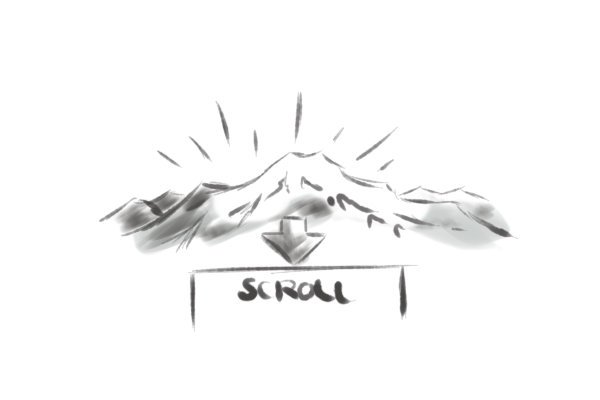
The use of reveals and ‘beats’, indicated by Bigrel’s earlier experiments, are deployed here, but occur when you scroll down the page rather than click, the images and words flowing into view. This downwards motion gives the strong impression that you are somehow ‘descending into’ the story, creating a new form of spatial and temporal relation to narrative. Moments of tension are created with the scrolling motion when, for example, a body is thrown overboard. Sound also plays a major role in the presentation – we read about what we hear and storms and songs fade in and out in synchronicity with the visuals. The title section states that ‘Headphones are recommended’, suggesting an introspective, solitary pursuit.
‘The Boat’ website is so fully immersed in audio-visual fluidity that it might just about escape the accusation of trying to digitally enhance any conventional reading experience. It could also qualify as embodying some of what Scott McCloud has meant by the idea of an ‘infinite canvas’. While this does not establish a new paradigm, it makes a provocative case not only for how a comic or graphic novel can be transformed by the digital medium but also for what can be done in the emerging sphere of interactive web-based literary production.
This article is part of a blog series about Storytelling and web design.
Key Links:
- ‘The Boat’
- Scott McCloud’s inventions (including the ‘infinite canvas’)
- Rachel Nabors’ course on CSS Animation
- Nabors’ post about how to create Alice in Videoland
- The Peugeot Hybrid 4 advert
- 3D JavaScript library (three.js) – includes ‘The Boat’ in its showcase
- ‘The Sound and Vision of the Boat’
- The Boat: About The Characters
- Sydney Morning Herald article on ‘The Boat’
- The Boat – Interactive Comic on Behance