• Skip to primary navigation
  • Skip to main content
  • Home
  • About
  • Blog
  • Contact

Corner Mindscape

Tell your story on the web

You are here: Home / Archives for Longform

The ‘Snow Fall’ Effect: Parallax Storytelling on the Web

10th December 2015 by William Corner Leave a Comment

In 2012, The New York Times published a web-based ‘feature article’ called ‘Snow Fall: The Avalanche at Tunnel Creek’. The story, written by John Branch, depicts the real-life tragedy of an avalanche encountered during the dangerous pursuit of back-country skiing. There are graphic descriptions of the aftermath; it is compelling reading. There is a strong sense of the ‘natural sublime’; the landscape is vast, awe-inspiring and capable of large-scale devastation. There is also an element of voyeurism related to the human tragedy that perhaps cannot be detached from the innovative visual presentation. ‘Snow Fall’ became famous for pioneering a high-production-value longform reading experience on the web, transformed by various multimedia elements and a technique known as parallax scrolling. The article led to a figurative avalanche of ‘art-directed’ longform multimedia features and a swirl of debate about their effectiveness.

The Parallax View: Multi-layered Storytelling

While parallax scrolling has its origins in the multiplane camera effects of animated films such as Disney’s Snow White and the Seven Dwarfs, parallax as a visual effect in computer graphics dates back to 80s video games (‘Moon Patrol’ is credited with being the first to employ it). I remember being ten years old and standing in a department store, staring wide-eyed at an Amiga 500 running ‘Shadow of the Beast’. The side-scrolling background was created from 12 ‘parallax’ layers, each layer scrolling slightly slower than the one above to create an uncanny illusion of depth through motion – in this case, a green field receding towards the mountains. The visual trick was a technical achievement for the time, summoning a landscape greater than the confines of the screen.

As video game hardware has become capable of producing true 3D environments, the 2D speed-based parallax effect has fallen out of favour. In recent years, parallax has been revived in web design, where it is used as a way of adding depth to (mostly) vertically scrolling websites. It has become a frequent design element in web-based storytelling, more often in journalistic features than works of fiction. In 2015 parallax has been around long enough to have peaked as a trend – major websites like Spotify, which previously employed parallax on their landing pages, have since redesigned them to be parallax-free. A University study showed mixed results about the effectiveness of parallax in User Experience (UX) design. However, User Experience (UX) or User Interface (UI) design trends are often concerned precisely with use – their utilitarian focus does not always reflect the new user/reader hybrid – are you browsing a hotel website or reading about an avalanche? While Parallax is only one of many techniques used in visual storytelling, it has perhaps been the most prominent and controversial. As we become more comfortable with web-based storytelling, we must ask if parallax adds anything to the longform reading experience and what might develop from its use.

Portrait and Landscape: The Importance of Frames

Unlike Kafka’s Wound (the focus of my previous post), ‘Snow Fall’ is a steadfastly linear read; parallax only works when the user/reader scrolls (most often from top to bottom) to further the progression of the story. ‘Snow Fall’ uses Chapters as clear starting points for the scroll, but once started, the reader encounters transitions rather than page turns; the parallax effect is employed at the top of the chapter and at various intervals where the page breaks away leaving the eye dangling over an animated mountain range. Perhaps ‘Snow Fall’ became an archetype precisely because the expansive visual experience reflected the subject matter. The point of using an effect such as parallax should be to exploit the relationship between form and content in a process of ‘framing’.

The parallax effect is just one aspect of this framing strategy in ‘Snow Fall’. As the page scrolls down, we encounter multimedia elements that fade into and out of the white background. The story is accompanied by a range of animated map data. We view the story from multiple angles or ‘frames of reference’; from the formal and scientific viewpoint of infographic data to the intimate personal viewpoint of photo galleries and testimonial video – often very emotionally charged in tone. ‘Snow Fall’ includes raw audio of a Mountain Rescue radio operator reporting the deaths of members of the group to friends and relatives back at the ski resort. The audio is embedded beside the writer’s description of the event – this is a still strange multimedia combination of prose writing trying to describe something that is also included ‘as it is’. This comparative space between the thing and its description now extends from the static relation of photographs and illustrations to temporal audio and video.

‘Snow Fall’ won a Pulitzer Prize and attracted much publicity in the online and offline print world, to the extent that ‘to snowfall’ became a niche verb-meme in the digital publishing industry and a ‘Snowfaller in chief’ was appointed at The New York Times. Praise and criticism is well documented in the web design blogosphere. Bobbie Johnson, writing on behalf of the well-known digital publishing platform, Medium, wrote an article called ‘Snowfallen’ in 2013 with the subhead reading ‘Just because you can, it doesn’t mean you should.’ Jonson was concerned that, in the wake of ‘Snow Fall’s impact, longform publishing platforms such as Medium would be expected to create more ‘innovative’ multimedia articles. We hear the familiar accusation of distracting presentation: “Can you even remember what happens in Snowfall? Do you remember who wrote it? What did the multimedia help you do?” These questions are best answered by reading ‘Snow Fall’ for yourself. Johnson goes on to point out the disconnect between form and content: “When you add multimedia elements, they have to work for the reader. They have to be in the service of the reading experience. They have to make the story better. Instead, they’re already starting to become the entire point of the experience.” The problem, as I see it, is that ‘Snow Fall’ fitted the ‘frame’ and that there is justified reservation about trying to fit other content into that same design.

Scroll to Continue…

Johnson provides a useful crowed-sourced google spreadsheet of articles similar to ‘Snow Fall’ which gives you an idea of how the technique has been used elsewhere (as well as some earlier attempts at multimedia storytelling). Notable examples are music website Pitchfork’s art-directed ‘cover stories’ on Bat for Lashes and Daft Punk, both of which incorporate animated photoshoot imagery into a multiplane magazine-style layout, and a subsequent NYT article called ‘Tomato Can Blues’, which combines parallax with graphic novel-style artwork to tell the true story of a cage fighter who faked his own death. In the case of the Pitchfork articles and ‘Tomato Can Blues’, the ‘framing’ is far more portrait than landscape. Interestingly, ‘Tomato Can Blues’ uses the multiplane layering of parallax to create a sense of claustrophobia instead of expanse.

An alternative example of web-based visual storytelling can be found in ‘Firestorm’, created by The Guardian (a rival to The New York Times for innovative web journalism). ‘Firestorm’ is the story surrounding the smartphone photos taken by a Tasmanian family stranded out on a jetty during a savage bushfire. Once again we are immersed in a sense of foreboding for most of the read, which leads to the depiction of a natural disaster; in the case of ‘Snow Fall’, the avalanche, in the case of ‘Firestorm’ the Bushfire. ‘Firestorm’ is more multimedia heavy than ‘Snow Fall’ using looping video backgrounds behind sparse text. Because of the constraints of video we are back in more familiar screen/frame territory here – a more claustrophobic experience. While Firestorm does not use the parallax effect to depict its landscape, it still uses the scroll to tell its story.

Given the range of web-based templates, libraries and services available now it is relatively easy to reproduce the basic framing devices of ‘Snow Fall’. The makers of a web design tool called Skroll Kit were apparently sued by The New York Times after they posted a YouTube video claiming that the layout could be replicated using their tool in about an hour. Skroll Kit has since been sold to Automattic, the commercial arm of WordPress, but there are numerous online solutions for building a multimedia story, such as Atavist, Shorthand, Racontr and the WordPress plugin, Aesop Story Engine.

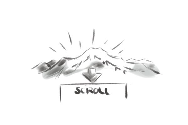
The parallax effect is capable of creating an immersive visual experience given the right content, but it doesn’t add out-of-the-box enhancement to visual storytelling. More often than not, when used without consideration, parallax can disengage a sense of continuity between form and content. The stereotypical parallax site wants to suggest expanse – parallax website templates often use stock photos of mountain ranges to showcase their visual effects in a strange echo of ‘Shadow of the Beast’ on the Amiga 500. It is vital that these types of effect are used appropriately as ways to frame particular content. However, it is also possible for the content to reconfigure the frame in interesting and unusual ways.

Perhaps one of the most visually striking recent examples of Parallax in storytelling can be found in ‘The Boat’, a web-based animated graphic novel commissioned by Australian broadcasting company SBS and based on a short story by Nam Le. ‘The Boat’ uses parallax, animation, sound and scanned sumi-e artwork. Here parallax suggests both the expanse of the ocean and physical and psychological claustrophobia. I will be looking more closely at ‘The Boat’ in my next blog post.

This article is part of a blog series about Storytelling and web design.

Key Links

  • ‘Snow Fall: The Avalanche at Tunnel Creek’
  • ‘Snowfallen’ by Bobbie Johnson of Medium
  • Johnson’s crowdsourced Google spreadsheet:
  • A University study at Purdue University into the effectiveness of parallax in User Experience design
  • Excellent YouTube series by Dev Tips exploring more examples, plus a tutorial on how to make a parallax website

Filed Under: Articles Tagged With: Longform, parallax, snow fall, storytelling, web design

Inspecting ‘Kafka’s Wound’: Innovation and Interaction in the Web Essay

23rd September 2015 by William Corner Leave a Comment

Reading on the web is associated with a decrease in attention span. As you read this, you are probably thinking about skipping a few paragraphs to see where things will lead. If you can get the gist of an idea by skimming and scanning, that’s maybe all you need. Why not just read the conclusion to swipe the key points and takeaways before attending to the numerous browser tabs or other devices dividing and competing for your attention? What do you gain from focusing entirely, and for a sustained period of time on one passage of text? What if that text also opens out into other content, demanding even more of your attention?

This poses a problem for any ‘long read’ on the web.

Reading is Already Interactive

The web is an interactive (or bi-directional) medium – but I would argue that reading itself is already interactive in a way that listening or watching is not, even if the interaction is between reader and text rather than between ‘writers’. While it takes attention and imaginative thinking to interpret sound and images, it takes the additional mental work (literacy) to understand a sentence and frame the resulting meanings and thoughts appropriately in the mind.

The front-end design of websites is moving away from skeuomorphic control panels to flat and fluid layouts with attractive typography, playing to the strengths of tablets and high-resolution displays. This has created an experience that feels more like a moving magazine. At the same time some earnest designers and developers have attempted to transplant longform writing to the web. Longform gives our attention spans a purifying ‘literate’ fitness regime to purge the sugary tweet, pin or listicle. It feels like a workout because reading and writing longform content is difficult and time-consuming compared to most other activities on the web. Websites such as Longreads curate this type of writing and blogging platforms such as Medium publish it.

Medium is a good example of the trend towards longer writing on the web, acknowledging its perceived effort – the site gives you an estimate of how long any given post will take to read. It seems to me, however, that Medium is mostly transplanting writing to the web, rather than transforming it. There is a good reason for this – transforming writing often leads to disorienting or distracting reading experiences. Let’s imagine the written text as the ‘main track’. The aim is then to create immersive experiences by adding other forms of interconnected media. In this situation, it is easy to end up not with immersive enhancement but with distracting asides which jolt us out of what was already an immersive experience with the ‘main track’.

Demanding Attention

The London Review of Books (LRB) is steadfastly committed to traditional long reads – the printed edition of this literary review presents four columns of densely-set type within which discursive essays explore subjects from contemporary Middle Eastern politics to the History of Science and the Philosophy of Mind. These are not the terse book reviews you may find in a Sunday broadsheet. The books under review are usually jumping-off points for the reviewer – an authority on the subject in their own right – to explore the subject within their own terms. Sometimes there are no books being reviewed at all. Here we are in ‘essay’ territory – the literary form pioneered by Montaigne and carried through to modern universities and the academic culture that surrounds them, but not much written or read outside of this sphere. LRB essays demand attention spans not associated with web-based reading, so in 2012 – perhaps as an act of provocation – the LRB commissioned a ‘digital essay’ which attempted both to transplant and transform writing on the web.

Attracting Distraction?

A web-based arts initiative called The Space, developed by the Arts Council and the BBC, collaborated with the author Will Self, Brunel University and the LRB to produce the digital essay, entitled ‘Kafka’s Wound: a digital literary essay by Will Self’. The main track of ‘Kafka’s Wound’ is a conventional essay by Self, exploring the various connotations of the wound of a terminally ill patient in Kafka’s short story, ‘A Country Doctor’ and the entire short story is accessible from one of the many hyperlinks offset in the margin. The essay is an exercise in associative thinking – the excavation of ideas and construction of new links between them. It is, on the surface at least, an exploration of the visceral immediacy of wounds – however the connotations suggest the opening up and absorption into a problematic and frightening space, involving virulent infection. Self writes more than once that he is guilty of absorption by associative thinking. There are clear connections here not only with the synthesizing preoccupations of an active imagination but also with the compulsive and ‘viral’ hyper-linking of the web.

A series of interconnected nodes, rather like a mind map, float and jostle for position above the text. The nodes are related to notes along the right margin. The node clusters have centralised colour-coded categories for content associated with the core text. The embedded content varies from an hour-long documentary about Will Self’s psychogeographical trip to Prague, to various artist’s responses to the themes of the essay. Are these responses and footnotes to the text of the essay, or part of the essay itself? The documentary is long enough to suggest that the essay could be a response to the film. In this space, the reader of a text necessarily becomes a user of a website – a reader/user hybrid.

In the same year a Pulizer-prize winning digital article called ‘Snow Fall’ appeared on the New York Times website and there was much noise about ‘production values’, throwing into question the likelihood of this type of article becoming the norm. I imagine the expense was not so much in the technology but in paying a team to create the interactive content. This suggests that the ‘opening out’ of content leads to a necessary call and response from and to different content creators. Even though there was a central author writing the ‘main track’ of text, both ‘Snow Fall’ and ‘Kafka’s Wound’ were produced by a team of collaborators. For ‘Kafka’s Wound’, much of the material was sourced from BBC archives or students at Brunel University.

The Long Web: Code and Convention

The designers of The Space used a customised version of WordPress to create the website. WordPress is a free open-source publishing platform, powering around 23 per cent of the web. The software has played a key role in making online publishing accessible by allowing anyone to install it and create a blog-based website in minutes. While ‘Kafka’s Wound’ is referred to as a ‘digital essay’ it was created using HTML, CSS and JavaScript , which have established themselves as the staple languages of the web. It is worth noting that anyone with the right know-how could recreate the form of this using free open-source technology, which – at least in ‘computer years’ – is likely to endure for some time. HTML may not be as proven as ink on paper but – as web developer Jeremy Keith argued in his talk, The Long Web – it might have the best chance of enduring over other digital formats.

These languages do not limit the format in a way which the printing press has limited the page – the use of native web technologies provide the layout with a more expansive feel, unencumbered by the confined frames of the previously dominant Flash-based ‘multimedia’ content or the earlier and even more confined CD-Rom. This is an important change from the idea of text embedded in a pre-defined screen-frame, to a formatted, styled document, which can open outwards on a potentially infinite ‘sheet’ or contract to arrange itself on whichever sized glowing rectangle you happen to view it on.

Necessary Experimentation

What is interesting about ‘Kafka’s Wound’ is the self-conscious experimentation. The whole project is, like Self, guilty of associative thinking – immersed in a frenzy of hyperlinks. These links both distract the reader and provide further insight. We are somewhere between the terms of post-modern decentralisation and disorientation and a more focused modernist experimentation with form.

Like many other ‘proof-of-concept’ projects on the web the digital essay aims to raise more questions than it answers. Relatively new industries such as e-Learning have been trying to establish paradigms and formalise the new medium, but the open-ended nature of what web technology can achieve means that that such attempts are prone to failure, both in terms of establishing themselves as paradigms and of delivering effective experiences to the user/reader. ‘Kafka’s Wound’, as an experiment, is able to flaunt disorientation in a way that a commercial project would not.

I am writing this in 2015 – ‘Kafka’s Wound’ came out in 2012 and not much has changed since then. I think this is because, while the web has some parallels with video gaming, the developments we are interested in here do not concern advancements in computer graphics hardware and augmented or virtual reality, but the slow development of a mature digital medium – giving a continuity and stability in the creation of form and content, a situation not quite the same as that indicated by retro post-modern ideas about ‘cyberspace’. While there is a common culture in the world of web (and computing in general) to see change as something rapid and often revolutionary, I think that we are in the early stages of figuring out how this more adaptable medium might lead to works of paradigmatic importance captured in novels and films (and also, arguably, video games). The technology itself need not be cutting-edge, but rather established to a point where what is done with it can lead to something comparative to paper-based literature – where a ‘website’ can have the same cultural impact as a novel.

This article is part of a blog series about Storytelling and web design.

Key Links

  • ‘Kafka’s Wound’
  • Jeremy Keith on the Long Web
  • Example of Javascript framework to create interconnected nodes
  • Brunel University research case study on ‘Kafka’s Wound’
  • Slideshare about the making of ‘Kafka’s Wound’

Filed Under: Articles Tagged With: Digital essay, Longform, Will Self

hello@cornermindscape.com

Copyright ©2019 · Corner Mindscape - All Rights Reserved